Client
Russian Personal Trainer
My role
UX Research
UI Design
Web Developer
Client
My role
UX Research
UI Design
Web Developer
This project consists of a group project of a website redesign for Russian Personal Trainer. The process began with a needs analysis and a content audit. We then continued with a card sort to present the proper taxonomy. Personas were created to gain an understanding of the end-user. Wireframes and high-fidelity mockups were constructed to narrow down the final design. We then built out the final design, deployed it, and presented it to the class.
see old site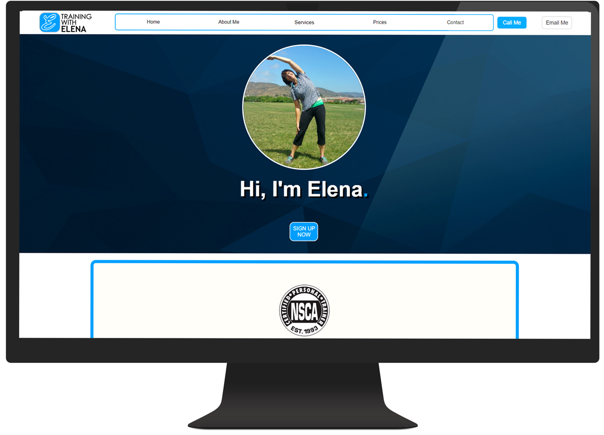
My team and I choose this website for our project for several reasons. The website did not look professionally done as it contains: an excess of ungrammatical text, a lack of engaging visuals and forms, and disorganized information architecture.
The redesign process began with a needs analysis on the original site to discover the following:
We then went through each page and each section of the site to identify gaps in the existing content and rated each item by its relevance, voice, accuracy, clarity, context, and currency.
To understand who the end-user was, we looked through her Google testimonials and crafted some user personas based on her reviews. Developing personas allowed us to answer the question of "who are we designing for?".
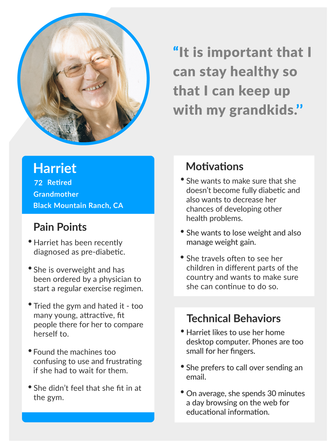
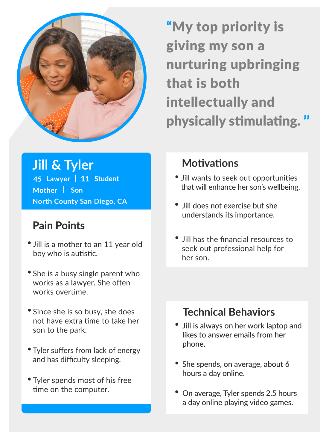
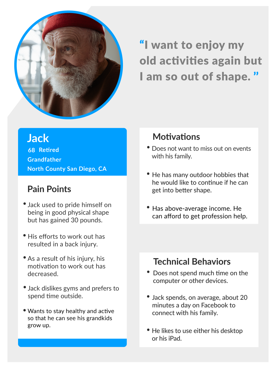

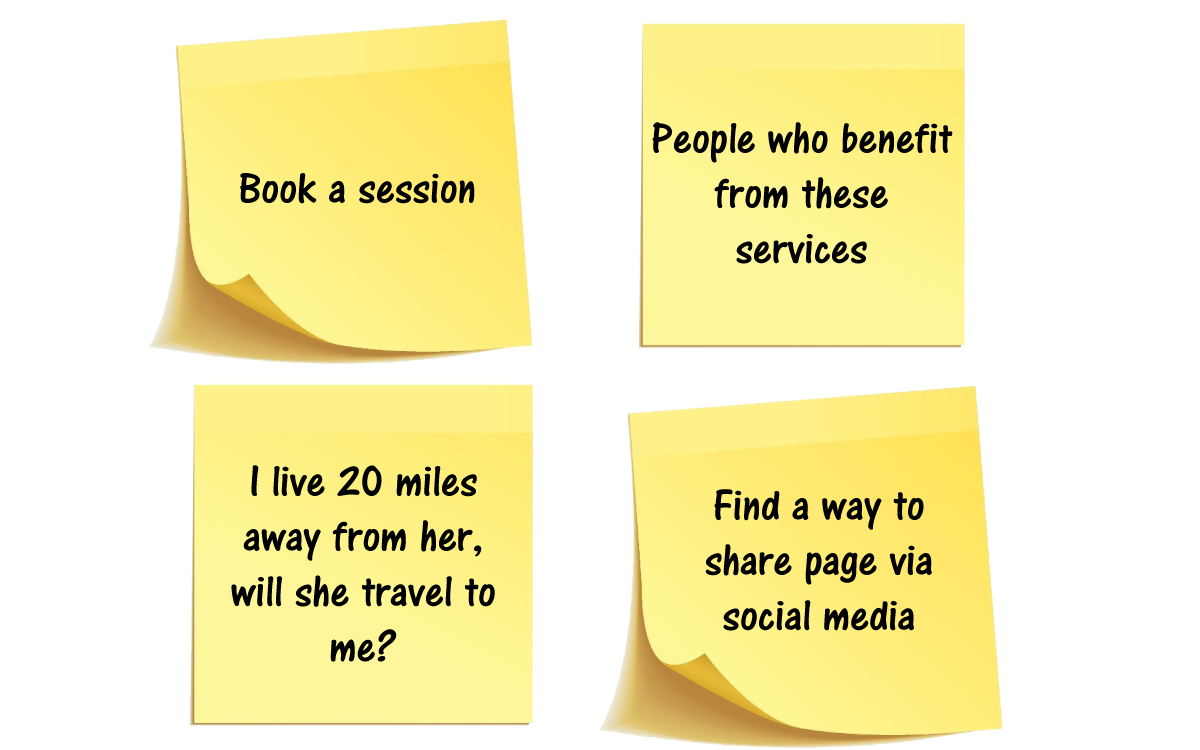
To stay user-focused while planing out our information architecture, we performed a card sort. We wrote out all our possible categories such as Services, Pricing, About Us, FAQ, Book Session, etc., and then wrote down questions on the front of the Post-it Notes that the users might have while thinking about buying a fitness package. We were then able to refine our categories used in the main navigation.
Next, the design process was kicked off by first creating wireframes and then the medium and high fidelity mockups.
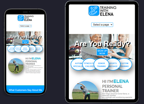
A fully responsive website was built out using HTML5, CSS3, CSS Grid, a few jQuery plugins, and some vanilla Javascript. Since we worked as a team, we each chose pages to work on and then merged them via Github.
If I had more time to work on the project, I would figure out a way to make scheduling an appointment with Elena fully functional on the website.