Client
Uptalent
My role
UX Design
UI Design
Web Developer
Client
My role
UX Design
UI Design
Web Developer

Before the revamp, the company offered a wide range of services that covered all aspects of digital design, web development, and architectural drafting services. We found that the market has a high saturation of all the former services mentioned except for Autocad drafting and Building Information Modeling through competitive research.
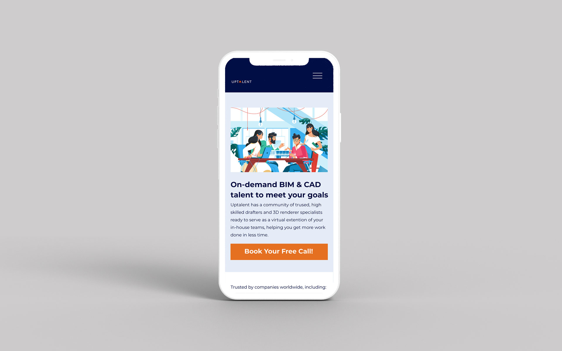
After analyzing what they had on their website and what stood out during our comparison, we deducted that the site needed to have more personality - it needed to be fun. Additionally, it needed to communicate that Uptalent were professionals in their field. Our main goal of the redesign was to create a landing page that would easily guide the user to book a consultation with the owners.
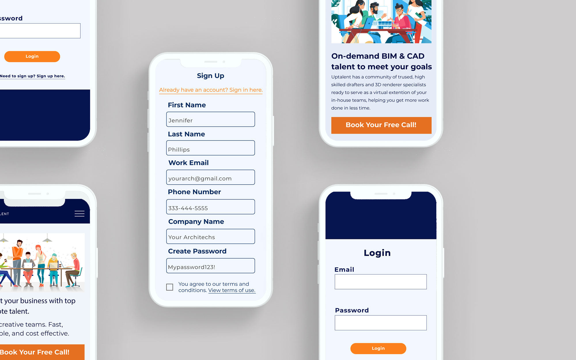
Lastly, the owners wanted to further enhance the user experience by having a custom-designed registration and login system that would allow the user to create their own members' account.

Instead of being a jack-of-all-trades company, we chose to narrow their area of focus to architectural drafting since we discovered that there are fewer companies that specialize in those services.
Ultimately, we decided to hide the homepage for the initial launch, which can still be reached by clicking on the logo in the top left-hand corner, and then used the architectural drafting page as our main landing page to highlight the chosen service. I created simple mockups to explore different layout ideas and then did the following:
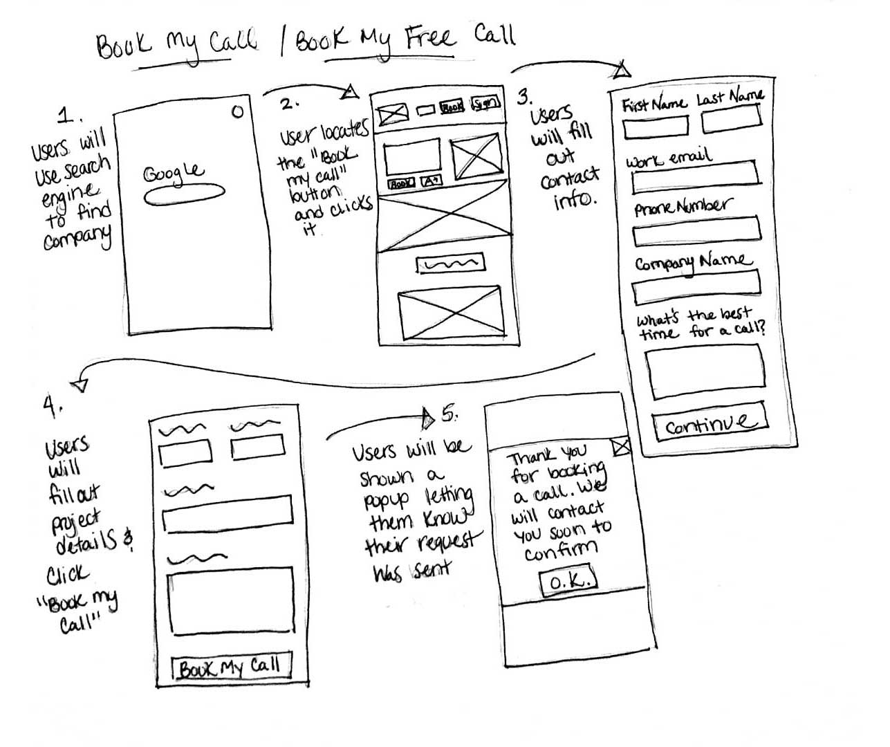
User flows were sketched out to help us understand the user journey. While undergoing brainstorming sessions with the owners, we concluded that there were three main possibilities as to what the user would want to accomplish.
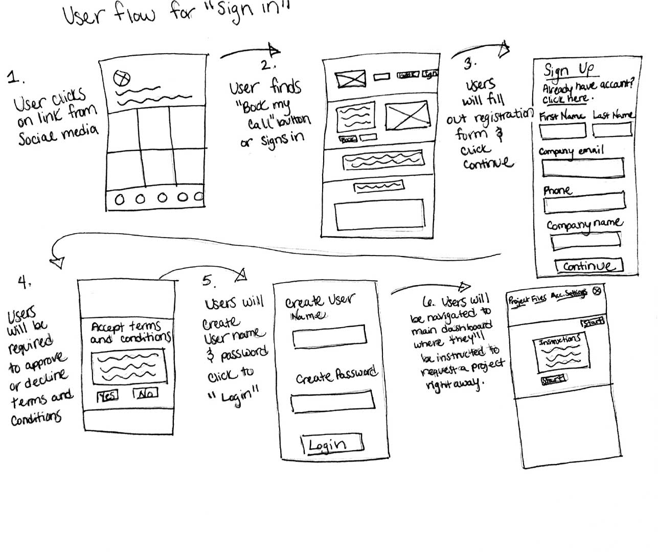
The user flows were drawn to explore the design of the custom registration and login system. Our goal was to breakdown each part into the smallest number of steps possible so that the client could easily create a member's profile.


By the end of my internship, I was able to build a unique solution for Uptalent's login system. The idea of having a member's profile that enables a user to permanently save their business's project information including payment information creates a seamless customer journey. However, given the short timeframe of the internship, I was not able to complete the entire member's profile or able to fully optimize the pages for mobile devices. While the allotted time allowed us to make sure the layouts looked good on mobile, we did not have the time to cut down on the amount of content each page has which would make for a better user experience. I suspect that the next intern will take care of these features listed. I excitedly wait to see how others improve Uptalent's application.